Web Refactor
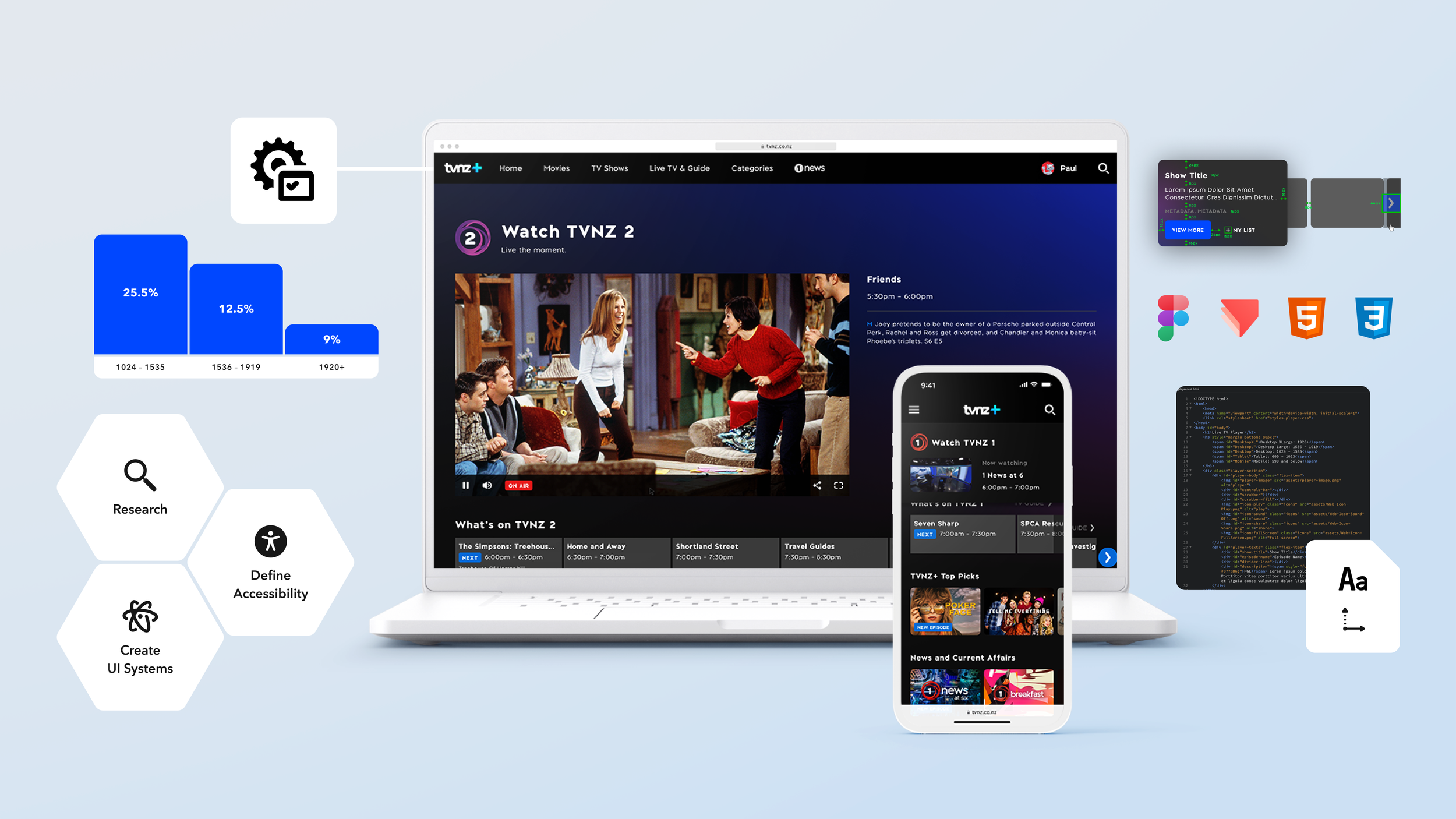
UX Research
•
Atomic Design System
•
Web Accessibility
•
Prototypes
•
UX Research • Atomic Design System • Web Accessibility • Prototypes •
Project Overview 🌟
An initiative to rebuild the current TVNZ+ Web Framework from EmberJS to ReactJS. The new framework is to enhance the performance of the web platform, boost future development pace and improve overall user experience.
The first stage of the project focuses on the Live TV page. The Live TV page was chosen because it consists of many complex components featured throughout the TVNZ+ web platform.
Business Goal 🎯
Implement a modern web framework to the TVNZ+ web platform, establish a robust design system, and feature web accessibility.
User Goal 🎯
As a user, I want to browse, and stream shows on the TVNZ+ web platform smoothly and intuitively. I also want to access the TVNZ+ web platform using assistive technologies.

My Role and Responsibilities.
My Role and Responsibilities 👤
My role was wide and varied as the UX Designer of the project. I was assigned many tasks and responsibilities, collaborating with many team members from different squads.
Plan and prioritise project initiatives with the product managers and tech leads.
Evaluate the current site for bugs and UX improvement opportunities.
Research to validate changes and understand accessibility.
Apply UX changes and improvements driven by data.
Define accessibility requirements and expectations.
Create a robust design system for the TVNZ+ web platform.
Provide prototypes to exhibit animations, interactions and transitions.
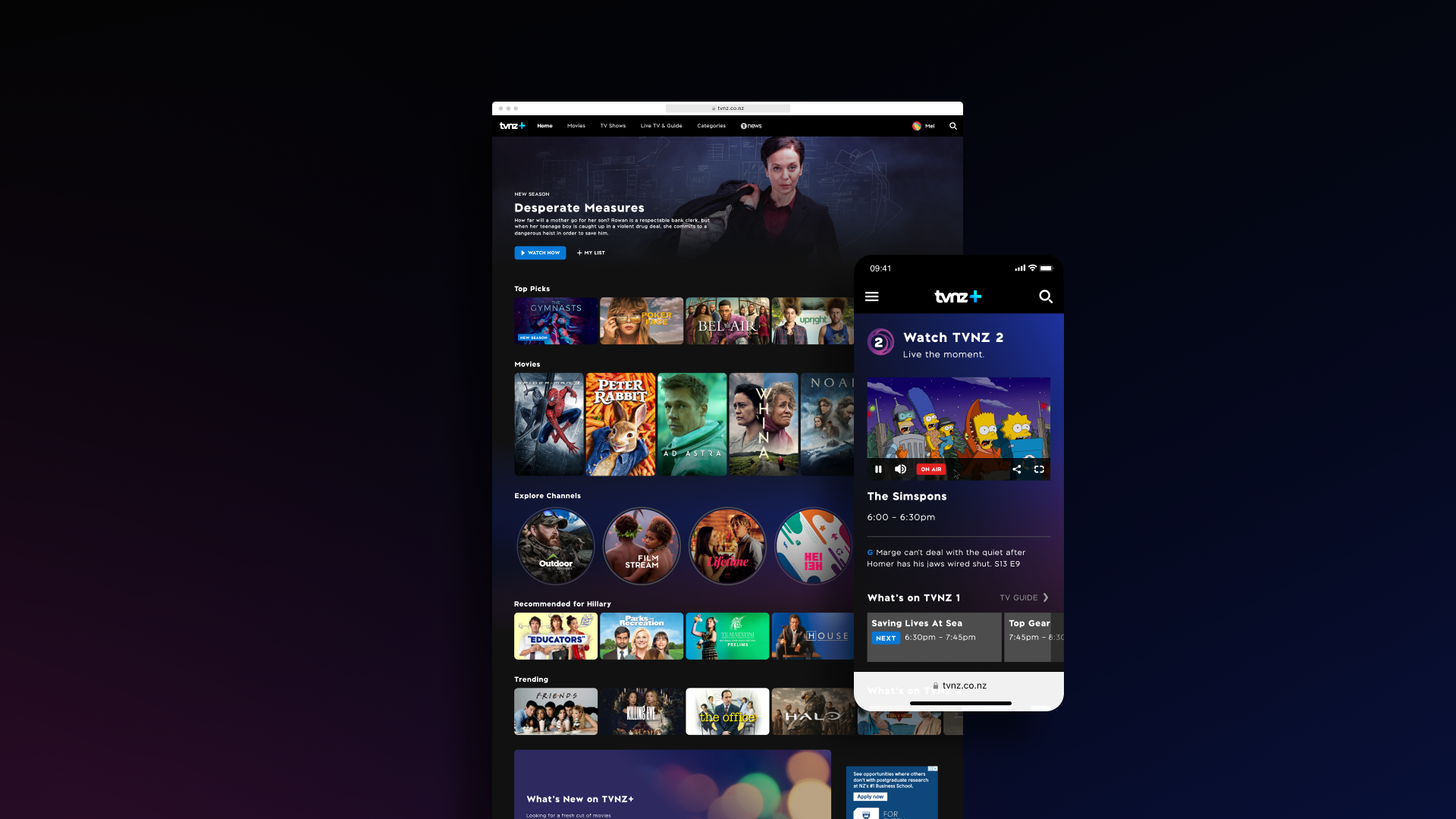
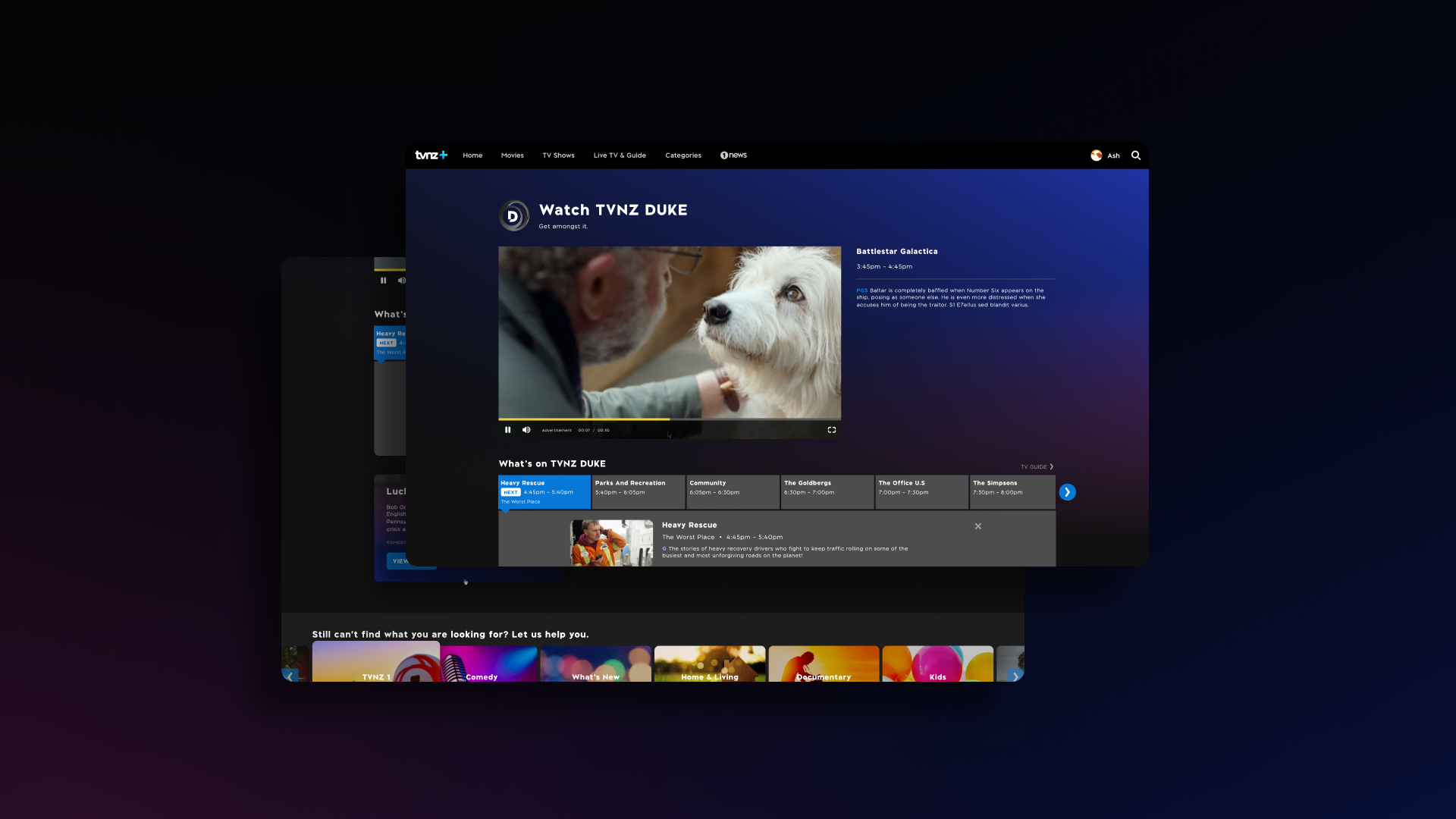
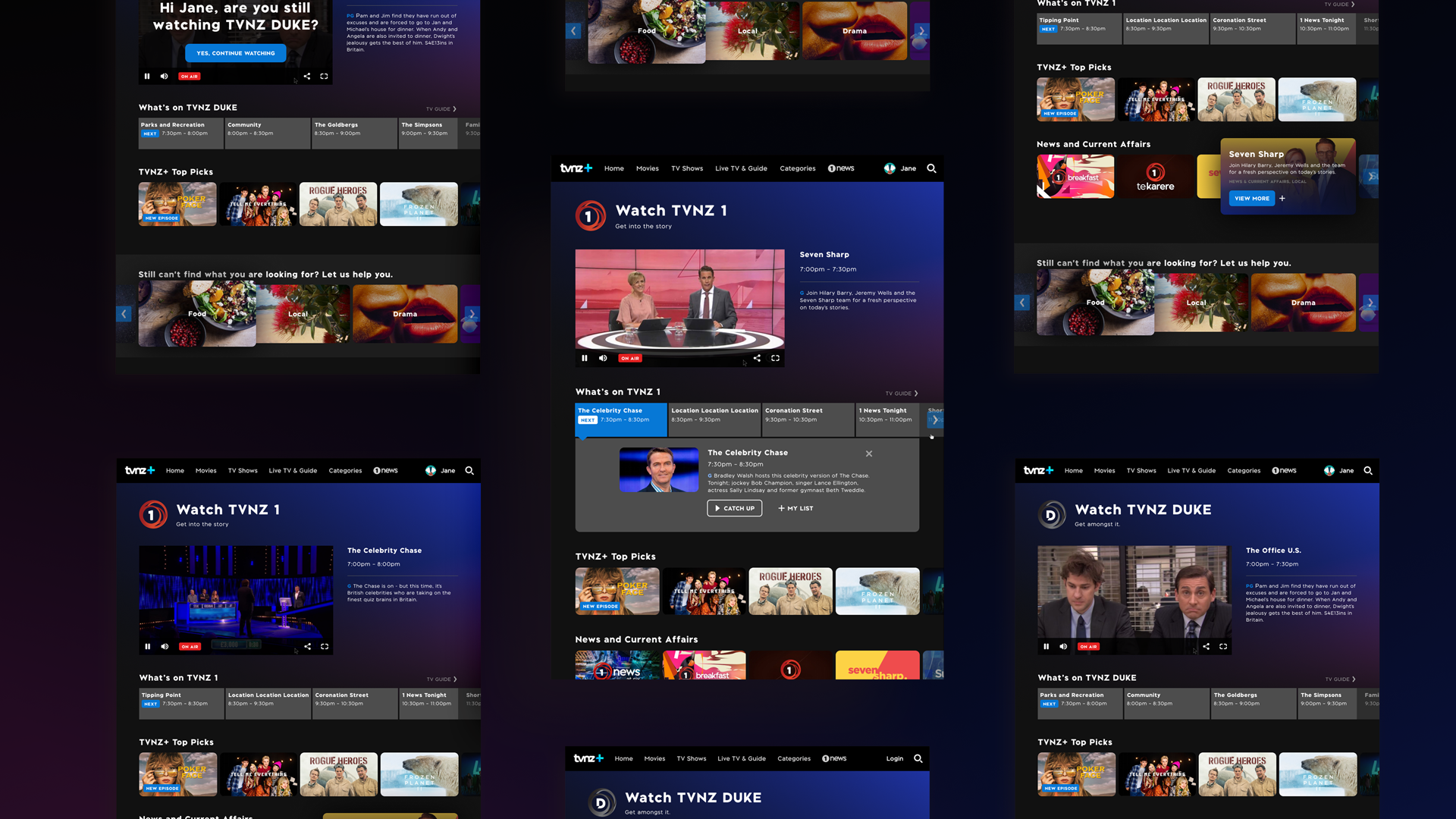
Final Implementation ✅
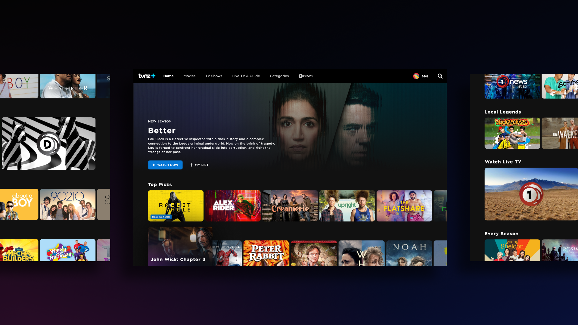
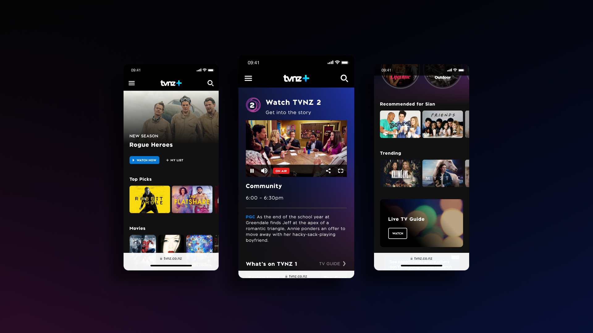
UX Process
Planning and Prioritisation 📏
We can confidently prioritise UX changes and improvements by having planning and sizing sessions regularly with the managers and leads.
Comprehensive planning and prioritisation for speed and efficiency.

Planning and Prioritisation.
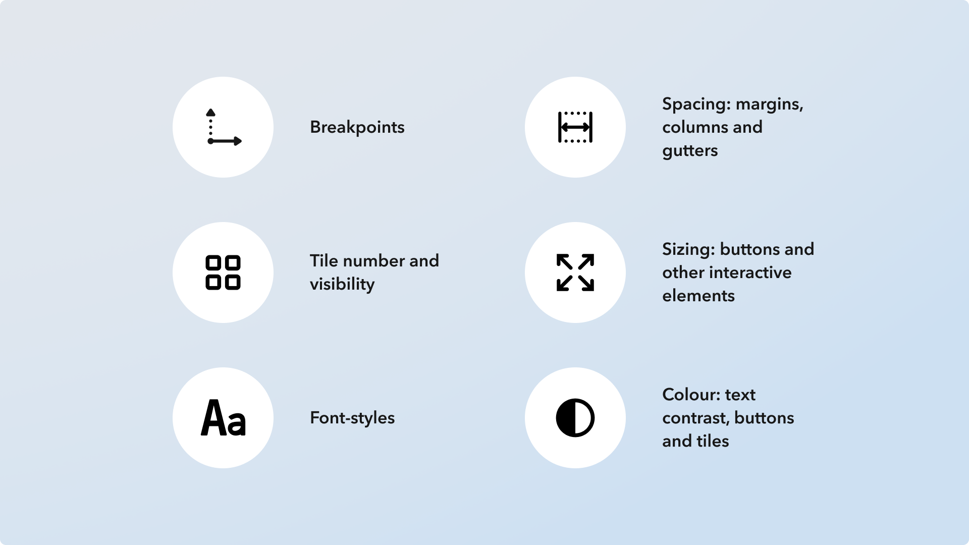
Initial Design Changes.
UX Research 🔍
A few research methods were conducted to validate the proposed design changes.
Site Analytics
Analytics was used to identify our users' most commonly used screens to define a set of new breakpoints.
I wanted to examine the Top 20 used screens for the past three months.
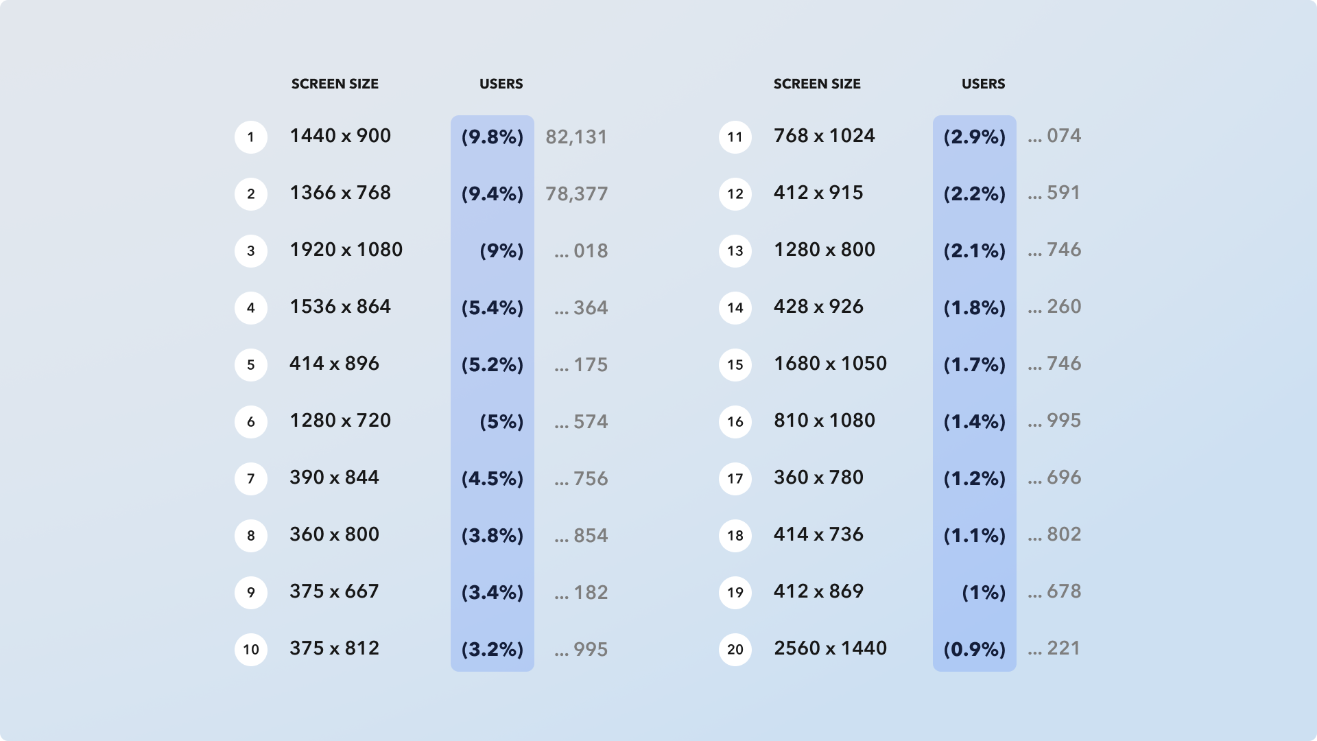
Top 20 most used screens (based on TVNZ_ data).
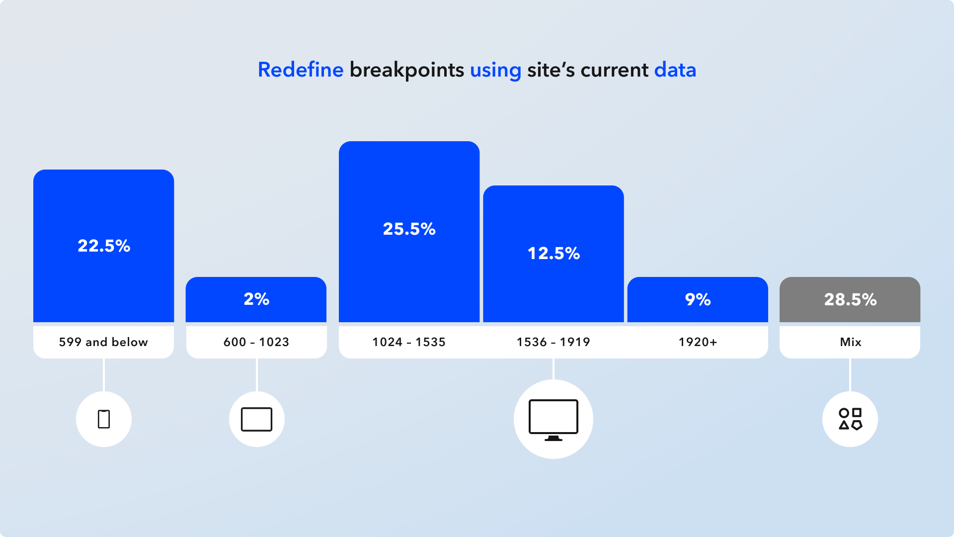
Data Visualisation.
Competitor Analysis
By analysing our competitors’ breakpoints and tile visibility, we can understand our user’s expectations when seeing tiles and belts in other streaming services.
Investigating familiarity and common patterns to apply new designs.

Examine Competitor Breakpoints.
Design decisions driven by data.
Comprehensive Study of Components
To understand and implement revisions, I needed to look at each component on a granular level from spacing, sizing, behaviour and function.
The learnings of each component are synthesised with other research data.
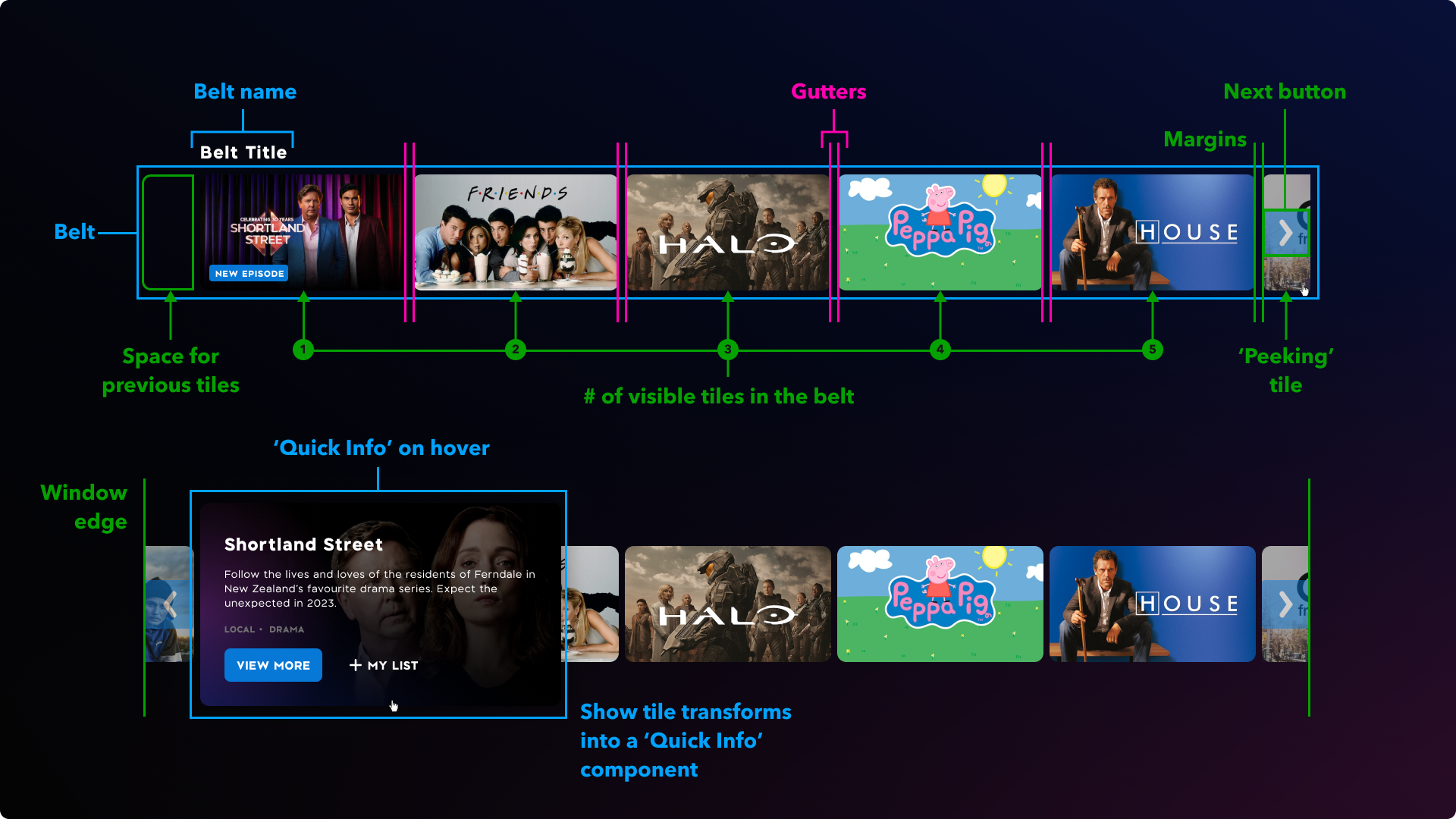
Component Study.
Heat mapping (Crazy Egg)
Identify where in the Live TV page has the least and most activity. Discuss and evaluate key interests like ‘hotspots’ with the squad.
Data to complement the current site analytics.

Heat Map Results.
Accessibility 🚹
Finding out what accessibility means for TVNZ+.
Accessibility objectives specified by UX:
Reduce pain points and overcome barriers.
It must be presentable to our users in ways they can perceive.
It must be operable; the product can be intuitively and easily navigated.
Information and operation must be understandable.
Robust enough that different devices and assistive technologies can interpret it.
Make our product more inclusive, giving equal access wherever possible to our users (Especially those with different conditions and impairments).
Identify Impairment Types and Conditions

Understanding Impairment Types.

Understanding Impairment Conditions.
Combine Type and Conditions
By combining impairment types and conditions, we can precisely understand accessibility needs and have a clear direction in finding the best solutions.

Design and Development for Accessibility
I had to provide more information for each component to meet accessibility requirements.
We closely looked into each element, specifying the correct markup code to meet requirements (In collaboration with the developers).
We looked into ARIA (Accessible Rich Internet Applications), Landmarks, Voice Over (VO) and keyboard navigation functionality.
Specifying the correct markup codes to meet accessibility requirements for development.
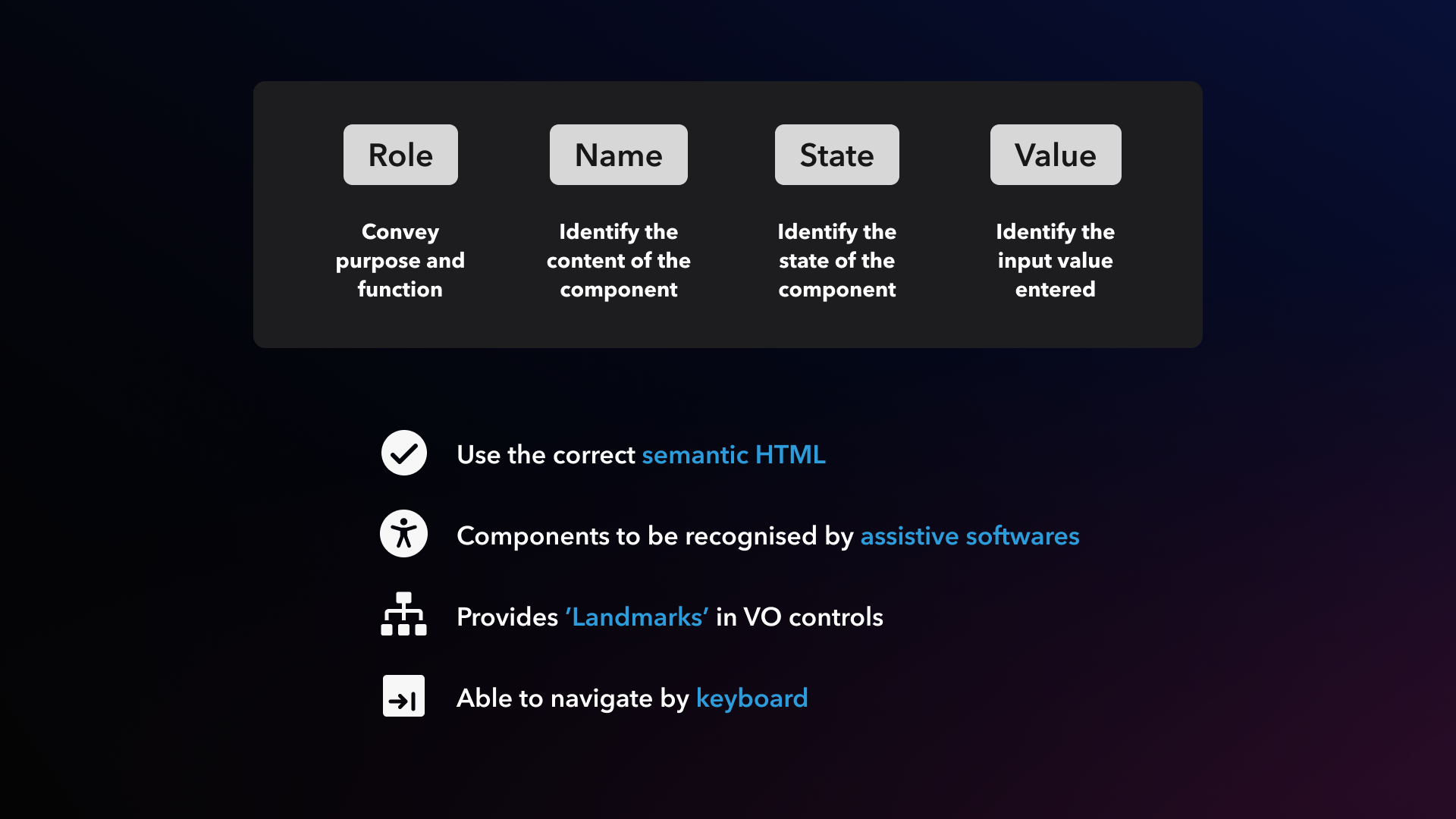
Accessibility Design Asset Properties.
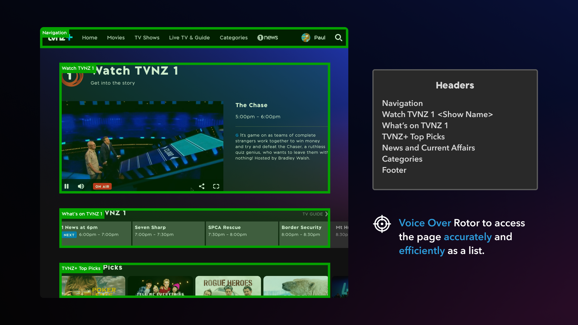
Accessing the page as a list to navigate and interact with the site.
Design System ⚛️
Since the product is being built from the ground up, there was an opportunity to redefine and recreate the design system.
Atomic Design: Creating a robust design system
The design system became very complex, considering the numerous shared components, different breakpoints, font style sheets, global colours and graphics.
Components are organised using Atomic Design Structure: Core, Modules and Organisms. All design assets are created in Figma, utilising the different asset levels from Teams, Files, Pages and Components.
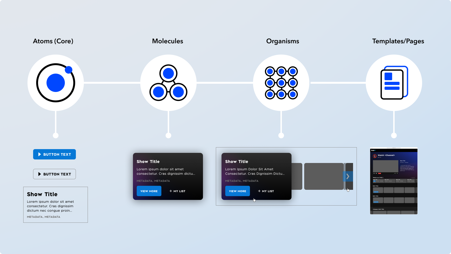
Atomic Design Component Structure.
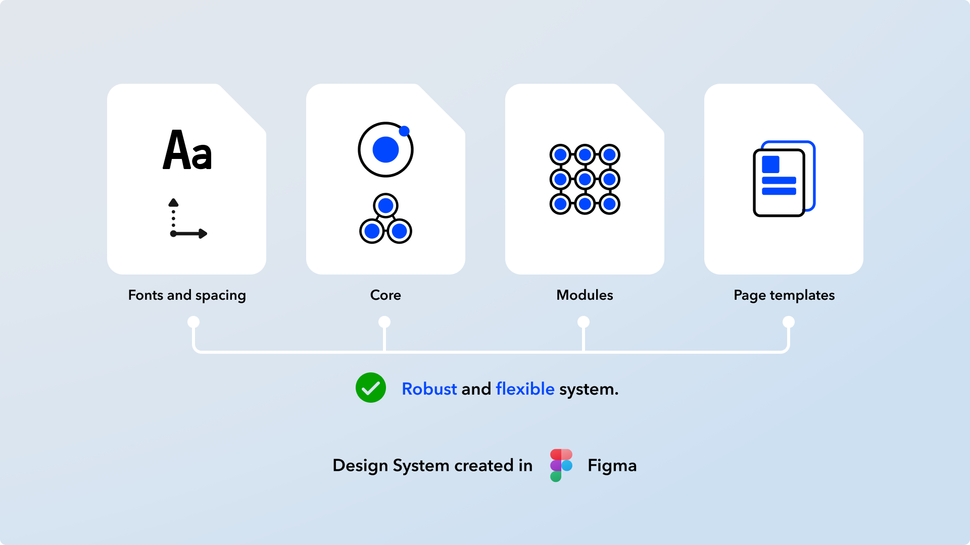
Design Assets Structure.
The design system must be robust, intuitive and flexible for the many phases of development.
Design Improvements ✏️
Identify current inconsistencies, pain points, components that do not meet best UX practices and production bugs.
Improvements were applied to selected components based on research data and evaluations.
Breakpoints
By establishing new breakpoints based on research data, we are able to introduce new page templates with confidence and justification.
To further validate new breakpoints, I used HTML and CSS to render on the browser as a mock-up. This also helped to render component sizing and spacing accurately.
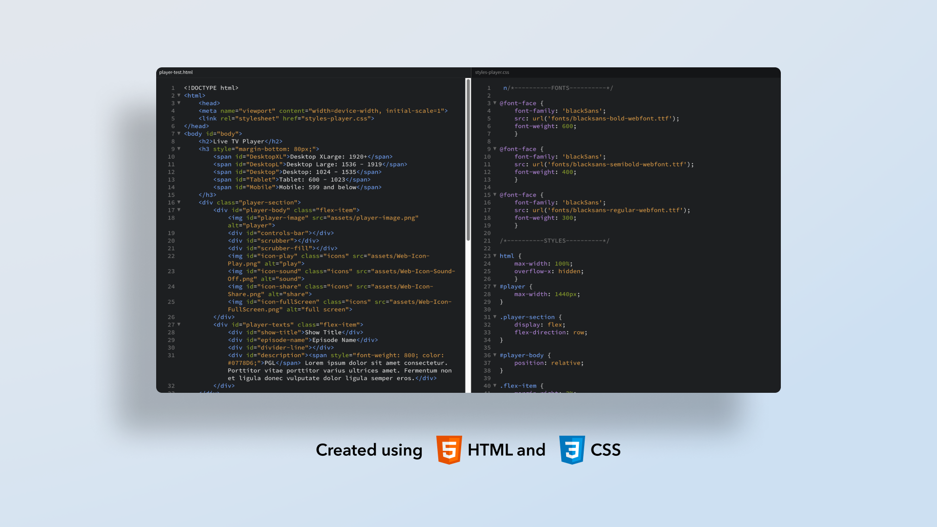
HTML and CSS (Used for design mockup only).
Show Tile Components for Mobile Screens
Based on UX evaluation and heuristics criteria, we have removed the titles and the My List icons below the tiles for mobile and tablet screens.
The tile ratio is now more ‘square’ to effectively promote tile artwork and be consistent with the TVNZ+ mobile apps.
Removed Selected Components
Based on data from UX Research and careful evaluation, some components were removed from the Live TV Page, such as social icons, breadcrumbs, promo tiles and MREC advertisements.
Some things to consider are the number of engagements, SEO impact and discussion with the Sales Department.
Sticky Player on Scroll for Mobile Screens
The sticky bar is now smaller on scroll to give more visibility of the page content for mobile screens.
8-Pixel Rhythm
The 8-pixel rhythm rule was used to define size, space and layout for visual unity.
It is a foundational framework for creating assets; it does not prioritise over optical sizing and web standard guidelines.
Category Belt
More tiles are now visible on smaller screens in the revised designs.
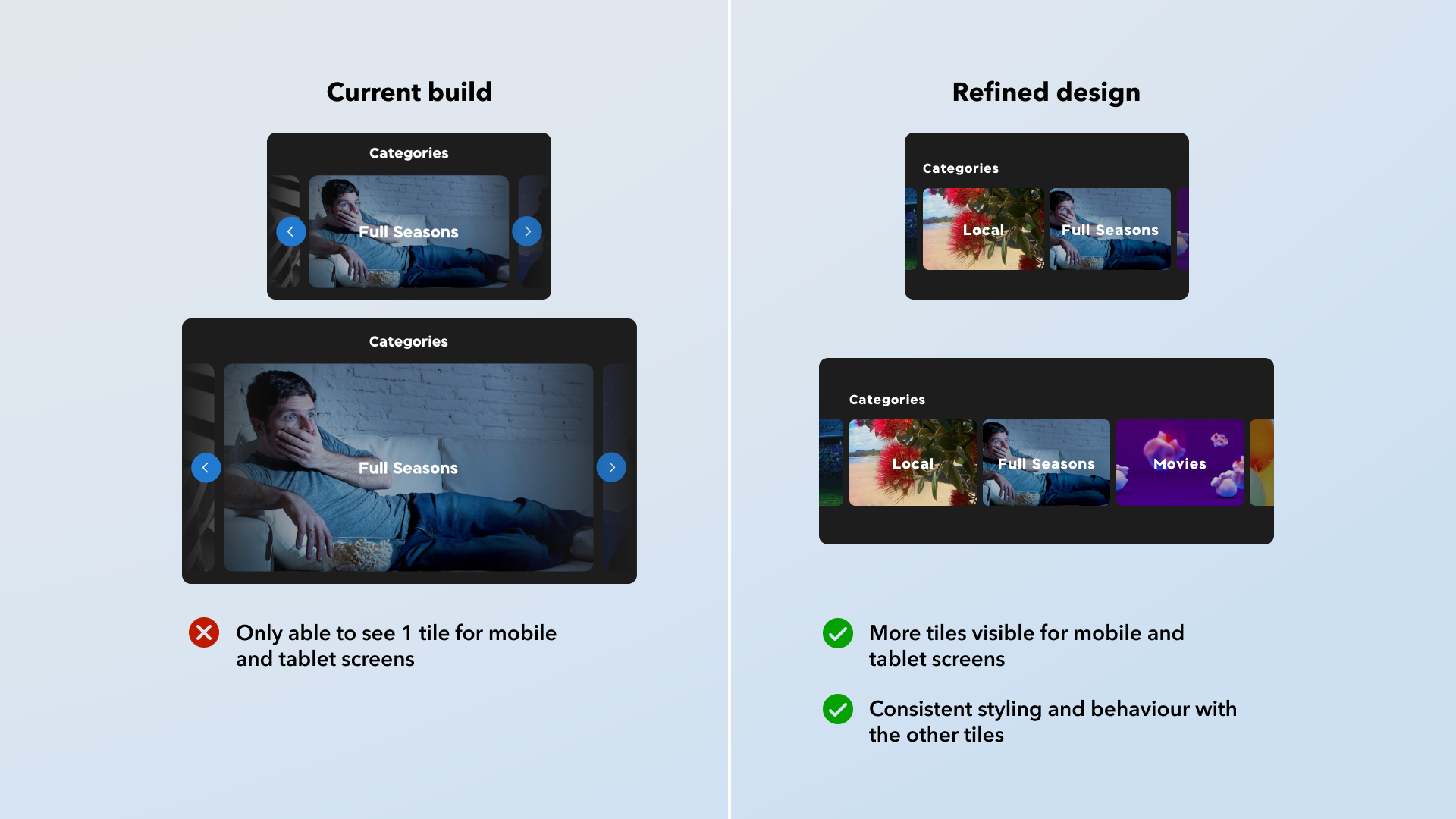
Category Tile Improvement.

Sticky Component Improvement.
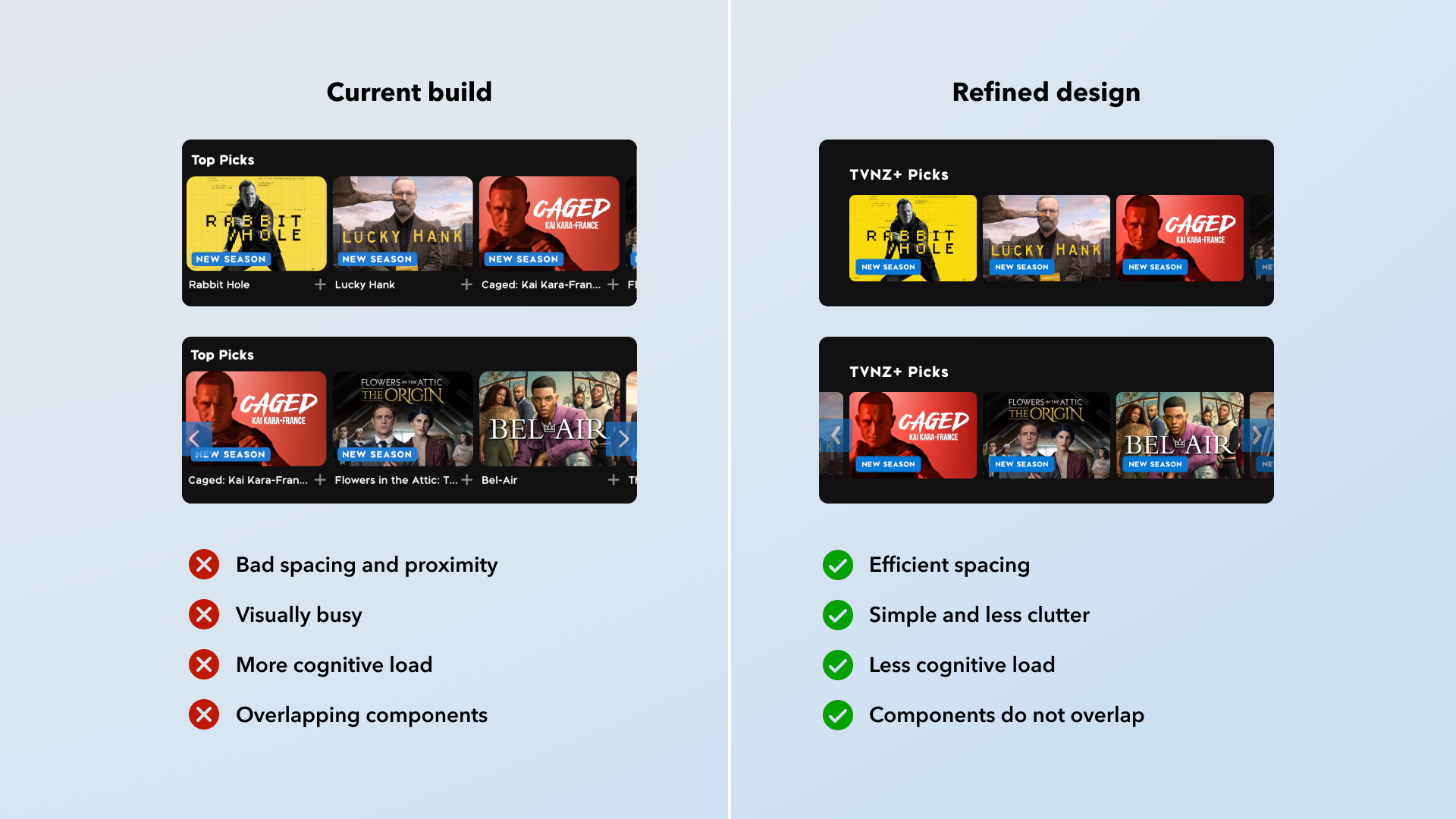
Belt Improvements.
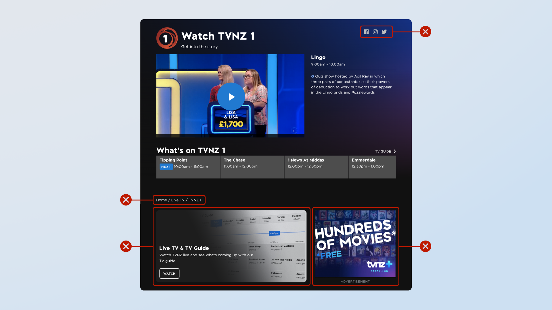
Removed Selected Components.

Apply 8-Pixel Rhythm.
Prototypes ⚙️
Prototypes were created using Protopie. Protopie assets were exported as interactive prototypes or MP4 files accompanied by the Figma assets. I would collaborate with the developer to discuss animation and interaction properties.
Reflection
The project required a lot of planning and research before the design phase. It allowed me to use several research methods, helping me lead UX direction, validate design decisions and understand accessibility requirements.
The Live TV page also required me to create complex components throughout the TVNZ+ web platform. Moving forward, this provides a bit of leverage when tackling the other web pages, as we can reuse and refine initial components created from the Live TV page.
It was essential to have a strong design foundation to create a robust design system. The design system I have established offers flexibility for any design changes and caters to big or small projects.
I have learnt a lot from this project, using several research methods, validating complex design changes using data, creating a robust design system and collaborating with different people. Rigorous planning and regular collaborations helped overcome complexities and made each phase of the project enjoyable.
